When it comes to 3rd party apps, despite having biggest market share, Symbian has the least number of apps. Nokia’s non-existence in the US market, lack of developer incentives & tools, an unattractive Ovi Store and no app UI guidelines – several reasons can be brought forward to explain this drought of apps. However, with Symbian^3, this is meant to change with the introduction of the Qt framework…
This post is Part 4 of Nokia N8 Review series. The remaining posts are here:
- Part 1 - The Hardware
- Part 2 - The OS
- Part 3 - Native Apps
- Part 4 - 3rd Party Apps
- Part 5 - Gaming
- Part 6 - The Camera
- Part 7 - Final Thoughts
These are the apps I had installed on the N8. At the time I was testing the device, there were only a handful of Qt apps, so I didn’t install any of them. The Wordpress app was available at that time, but because I don’t use Wordpress, I didn’t bother to test it.
I won’t be reviewing many of these apps because some of them have already been reviewed in the N97 review & the E72 review.
TuneWiki is a lyrics search app while Shazam is a music recognition app. Pixelpipe replaces the Symbian^3 Share Online app & allows uploads to more than 100 social networks, blogs & photo/video sharing sites (including Picasa & Flickr).
As for CorePlayer, that is the S60v3 version which I tried to run on S^3 using a virtual keypad (added by the block-named app – WFVirtualKeyboard). Which didn’t went well.
As in the N97, you can add your own overlay portrait Qwerty keyboard, now known as Baidu Input. However, it’s still a beta version for S^3. Review here.
Another interesting app I didn’t try out is SPB Mobile Shell, a home screen replacement. Video from the hands-on review on NokiaExperts.com.
Swype
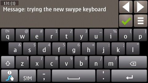
If you own an N8, that’s the first app you should must install. It gets rids of the Tata Nano (the default keyboard) & replaces it with a Ferrari 458. However, because there’s no portrait Qwerty keyboard (yet) on the Symbian^3, you can only use Swype on the landscape keyboard. Unfortunately, Swype seems to have adapted the old-styled text-entry system & replaced it with its own keyboard.
Swyping is actually very simple. You just need to drag your finger on the corresponding letters (doesn’t matter if you go over other characters) & the word is typed.
& it offers up suggestions if Swype isn’t sure of what word you have typed.
However, I’m not recommending Swype because of its new input mechanism. Swyping really isn’t suitable for landscape Qwerty keyboards (but it would be brilliant in portrait). I prefer to use the Swype keyboard as a normal keyboard because it’s just miles ahead of the default Symbian^3 keyboard.
First, it shows you the symbols you’d get if you long press (or tap-hold) each key.
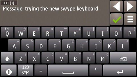
Tapping the Shift key gives you capital letters, more symbols & turns the delete key into a delete word key.
Tapping the SYM key gives this.
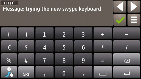
& then tapping 123 gives the numeric keyboard…
Tapping Shift & ABC gives this Symbol-only keyboard.
There’s also an Editing keyboard which is activated by swyping from Swype key to SYM.
Among other little tricks, a short press (tap-hold) gives the symbol character while a longer press (long tap-hold) gives the list of accented letters.
There are so many other tricks that make Swype a lesson in usability!
Going through the Help file is the first thing every Swype user should do. Tweaking the Settings is also necessary if you want to find the right balance between speed & accuracy. The only con I can find with Swype is that it doesn’t support multi-touch, so you can’t shift+press another key at the same time. Otherwise, it makes typing on the N8 really enjoyable instead of chore it was previously. Well, at least in landscape mode…
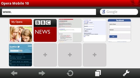
Opera 10.1
In my N97 review, I had outlined 9 points why it’s fantastically better than the default browser.
Except on Symbian^3 it crashes every 5 mins due to a bug with the keyboard which makes you want to rip your hair out. The recent update fixed it. Fortunately, with the History feature, you can restore browsing your web pages until… the next crash. My other complaint is the lack of pinch-to-zoom & flash support.
I hate how the web browser can’t re-arrange the content to fit the screen (at 100% zoom). For example, here’s the Facebook Touch website & Google Reader.
& Twitter mobile. To reply to a tweet, you have to scroll. Honestly, I wouldn’t only blame Opera, but also the 16:9 resolution. Well, you see, most of these mobile webpages have been made with Android & iPhone in mind. When Symbian jumps in at 360x640, the user experience is ruined…
X-plore
X-plore is quite hard to use with a capacitive screen. Still, it remains the best file manager Symbian never had…
For accessing Facebook on Symbian, you have 3 options – use the web version, use the Social app or use the official Facebook app. To download the latter, you’ll open up Ovi Store, search for it & download it… At least that's how it worked on previous devices. For the N8, you can't do that because the Facebook client isn’t available on Ovi Store!
Is is incompatible with Symbian^3? I doubt it because it ran without any glitch on the N8. However, to download the client, you’ll have to jump through hoops. First you’ll have to download the Facebook app via the web by disguising as an N97. However, the install files are drmed, so you need to hex-edit the file first & then transfer it to the N8 to be installed… Tutorial detailed here.
Twitter clients
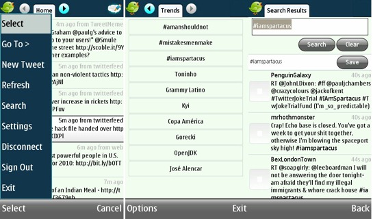
Trill
Trill is a quite basic Twitter client.
Tabs – Home, Replies, DMs, Public Timeline, Friends, Trends.
There is no kinetic scrolling, no lists support, no classic RT support…
Beyond the cheesy interface & animated birds, Trill is no thrill to be used. Power users won’t like the 15-min update intervals. But it’s free, & you’re getting what you (not) paid for. Decent client for users with limited data connection & few friends.
TweetS60
TweetS60 exists as a Lite & Pro version. The Lite version has no list support, no search & no trending topics. Home, Replies, DMs, Favourites & your own tweets – these are the tabs available.
TweetS60 has a few interesting settings, including custom AP, 2-min refesh & vibrating alerts/tones. However, the app itself is incredibly slow. Tweets takes ages to load. The initial setup where it downloads all profile pics takes around 5 mins – the first impression is a definite turn-off. Not recommended.
Socially
Support for Facebook, Twitter, Foursquare & LinkedIn! Hell yeah!
The UI is nothing to shout about, but for the features, it has the goods.
As for Twitter support, it’s the most fully-featured FREE Twitter app. It has everything except the refresh rate is limited to 30 mins.
That’s the main screen of the Socially. Notifications displayed here can also be pushed to the desktop (home screen)! The best feature is from the Facebook app – Socially can replace your contact photos with their FB profile pics & sync their birthdays to the calendar.
Verdict - watch this app. List of all features here.
Gravity
There really is no need to present Gravity. It has always been the best Twitter app for all Symbian smartphones. The demo version I was testing supported Twitter, Facebook, Google Reader & Foursquare (Flickr is in the full version).
Previously, Gravity used the 2-row button UI with left & right arrow buttons. Now, Gravity assumes everyone knows how to flick left or right & has adopted a translucent 3-button UI (which looks better than S^3 default ones).
Opening a Twitter URL gives you several options – Open in default browser, copy to clipboard or save it to… Read It Later, Instapaper & del.icio.us.
& here you see why I was bug-testing this alpha version of Gravity – it has its own split-screen keyboard!
While the keys may only show capital letters, it’s a fully-featured portrait keyboard. Tap-hold a key & you get the accented letters. & it’s also available in landscape!
The Facebook isn’t particularly appealing (probably because it ain’t blue & white) & neither is Google Reader. It’s only when you open the Settings that you realise why Gravity is the best Symbian app available. Full list of features here.
Widgets
Battery Monitor
Nokia Battery Monitor is an app which monitors how much battery each app drains & gives you an idea how many hours you have left depending on your usage.
It does require at least a week of monitoring before it starts showing meaningful data. Battery Monitor gives valuable insight to both the user & Nokia on how to prolong battery life by reducing usage of the most power-hungry apps.
MemInfo
Shows memory usage & provides shortcuts to toggle services like Bluetooth.
& by the way, I didn’t install any task manager on the N8, because Symbian^3 has been extremely stable. The visual task manager is enough to close down apps & I’ve encountered Out of memory errors only twice. When it comes to stability, the N8 is the nemesis of the N97.
MazeLock
An unlock screen replacement if you want a simple way to unlock your device without having to enter numeric codes.
Grid
ScreenSnap are well-known for those ad-supported utilities they offer on Ovi Store. However, with Grid, they’ve finally made something that’s not only visually impressive but also very promising…
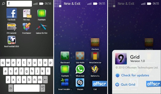
Grid can’t be called a menu-replacement because it doesn’t deactivate the menu & it’s still an app running in the background. Grid is an app launcher, Android-styled. Grid consists of 9 screens, each containing up to 36 icons. The 9 screens – Common, Utilities, Settings, Miscellaneous, Applications (x4) & New & Exit.
Apps can be moved around & the screens can be renamed.
Furthermore, there’s a Search (with custom keyboard) to find apps. The New & Exit screen displays the newly installed unsorted apps.
You need to watch the video to know how awesome Grid is. & mind you, this is only the beta version 1.0.
Which brings me to the question – why couldn’t Symbian implement something like this?
Wrap-up
Symbian is doomed. At least Symbian^3 in its current form is. From a user perspective, what are the compelling 3rd party apps that makes Symbian more attractive than other competing OSes? There is only one – Gravity. & if you aren’t a Twitter user? In that case, it’s none! Decent video player? Nope. Official Twitter app? None. Official Facebook client? Not supported.
Back to Gravity, it is the killer Symbian app! The attention to details & the effort put in to make an app that customizable is praiseworthy. Nokia should consider making Gravity the default Twitter client instead of working on that half-baked Social app. Probably because the efficient & simple UI of Gravity is a slap to Symbian UI designers. Not to mention that the Qwerty keyboard already looks better than what Nokia are planning to add…
& by the way, you know your OS is crap when developers (Opera, Gravity & Grid) have to implement their own keyboards to make their apps usable…
The writing is on the wall. Symbian isn’t attractive to developers. Nokia are concentrating their efforts on promoting Qt as a common platform between MeeGo & Symbian. However, their strategy have a massive flaw – Symbian’s future depends on MeeGo. If MeeGo is good, 3rd party apps will be developed for both. If it isn’t, well…
This post was Part 4 of Nokia N8 Review series. The remaining posts are here:


