
In the previous post, I discussed the hardware of the N97. While the exterior is stunning, the innards (CPU, memory) are less so. In this review, I'll be looking at the OS & native apps. Having used S60V2 & S60V3 for many years, the N97 is my first experience with S60V5...
Symbian S60 5th Edition or Symbian^1
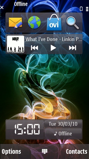
When it launched, the N97 was the 2nd S60 touchscreen phone from Nokia, following the 5800 XpressMusic. Symbian OS 9.4 or S60v5 was Nokia's response to the meteoric rise of touchscreen smartphones. Rightly so, S60v5 was nothing more than a revamped S60v3 with a touchscreen optimized UI & bigger resolution. Gradually, through the different firmware updates, S60v5 has been shedding its S60v3 legacy & more Symbian^2 (OS 9.4 is actually Symbian^1) features have been adopted.
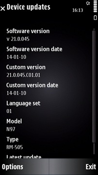
The unit I received runs the 2nd most recent firmware, v21.0.0.45. Recall that the N97 was launched back in June 2009. This means that Nokia have had more than 6 months to fix all glitches & add the new features that justify the N97's flagship status. So what I'm expecting is a matured device free from all those problems that plagued the new N97 owners...
Bootup time - 40s. There is a slight (2-5s) delay from the time when Home screen appears, to where the phone is actually usable - i.e. you can launch apps without any slowdown.
S60v5 on the N97 is very stable, unless you decide to tinker with it by installing apps that modify the system. With my initial apps frenzy, it took only 4 days before I was forced to hard reset the phone. After that I proceeded cautiously with my installs & it has been working great so far, apart from a few times when the OS restarted.
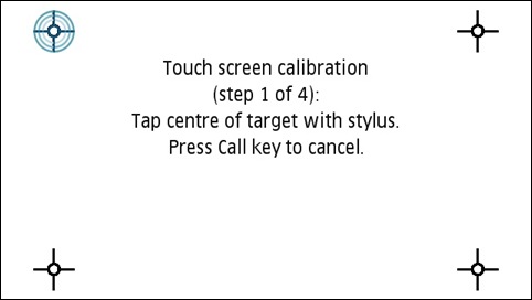
The first time I used the N97, I was appalled by its touch screen performance. Several taps would not get registered & it was so imprecise that I had to tap a few millimetres above a key for it to be registered. This unpleasant experience continued until I discovered the touch screen calibration settings. It fixed everything. A firm but gentle tap is all that it takes - feather touch won't work since this is a resistive screen.
So my first word of advice to touch screen owners - calibrate your devices frequently!!!
Home screen

The home screen is pretty similar to all previous S60v3 devices, with a few exceptions.
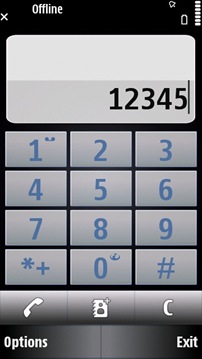
First, the center key has been replaced by a keypad shortcut for dialling numbers (supports DTMF).

Secondly, it's entirely widget-based. While the clock widget is permanent, up to 5 more widgets such as app shortcuts, contacts bar, music control can be added. 3rd party widgets can also be installed, including those from apps such as Facebook & Gravity to display live updates & tweets. For example, the Shortcuts bar will show the most used apps. Unfortunately, the widgets are restricted to their tiny space & apart from linking back to the main app, they cannot provide say, a pop-up box for tweeting... Nokia's implementation of widgets is great, but it can be further improved.
Flicking the home screen right or left hides/unhides the widgets. Unlike the other mobile OSes (including Maemo) with their multiple home screens, the N97's home screen is one-dimensional. Hopefully, that'll be remedied in the forthcoming Symbian^3.
Main Menu

The main menu can viewed as a grid or as a list. App icons are installed in the Applications folder by default & can be moved around or added to folders using the Organise option. Apps can also be uninstalled directly from the menu.

I've noticed a 2-3s lag when opening the main menu & folders with large amount of apps. This is due to the slow 434Mhz CPU refreshing its cache of installed apps.
Kinetic Scrolling
One major feature that was added in firmware v20 is kinetic scrolling, used to make scrolling & dragging appear more fluid, more natural... Vertical kinetic scrolling is present everywhere there's a list/pane to scroll. But only the Photos app & browser implements kinetic scrolling across all directions. A scrollbar is also available for faster scrolling through long lists.
Multi-tasking

Of course, as will all S60 devices since 2002, the N97 can multi-task. Switching between apps is done by holding down the menu key. In the main menu, apps running in the background are indicated by a spinning wheel icon.
A long press on an app icon gives the option to exit an app. Multi-tasking on S60 is exactly on your desktop - all apps can run in the background, internet-connected apps can auto-update, games automatically pause when switching. Apps have no restrictions at all, except one.

& it's here that the N97 reveals its most critical flaw - RAM. Of the 128MB available on-board, the OS takes a huge chunk off it, leaving only 50MB of free RAM available on boot. Most of time the free RAM averages 40MB... which allows you to run less than 10 small apps. Or enough for around 3-5 big apps. Or 1 huge app. Here are a few situations which caused apps in the background to be killed without any warning:
- Opening a photo full-sized in the Photos app.
- Opening a heavy webpage in the browser/Opera Mobile.
- Using Ovi Maps.
S60v5 is a powerful OS with excellent multi-tasking capabilities, but crippled on the N97 because of a lack of memory. As we would say on Twitter, it's an #EPIC #FAIL.
On-screen keyboards

This is the only alphanumeric keypad that appears when using the touch screen to type in portrait mode. Unlike other OSes, it doesn't popup/hover over the app, but instead whisks you away into its own screen with its smallish text input box & with an OK (tick) button found miles away from the input keys. That is so disorientating!

I understand that Nokia wanted to replicate traditional keypads - & mind you this is a great keyboard for both one-handed & two-handed operation - but hey, couldn't we have more options, like a Qwerty keyboard for use with the stylus.
Supports predictive text input & copy/paste. Although there is a right & left button to navigate through the text, other than manually selecting the text, there is no other way to move up & down.

Symbols & number mode. General vibration feedback is excellent but won't
allow you to operate it without looking at the screen.

Handwriting recognition. Works most of the time, but it's slow. Useful for Asian character input...

The landscape keyboard is the same... Yes, there is no Qwerty on-screen keyboard for the N97. While it's understandable that with a real keyboard available, you wouldn't need a virtual one, but still....

In fact, Opera was so pissed off that they made their own on-screen keyboard... which makes the default keyboard look prehistoric.

From the key gradient to the hovering letters, it all spells awesomeness.

& unlike the default one, this on-screen keyboard actually hovers on-screen. If only we could use the Opera keyboard everywhere...
Native Apps

As if lack of RAM wasn't enough, you'd think that 32GB would be enough for anyone to install apps... Wrong, because there's still the internal memory where all native apps are installed & it's also used as a cache by the browser, messaging & contacts. It's only 75MB.... total. The best part? After installing all the apps & at boot-up, only 40MB is available. Imagine the problems an average user will face once he finds out that he can't browse properly, store new emails & add new contacts, simply because being an average user, he installed all his apps by default in the C: drive, the internal memory.

The Calendar, Messaging & Contacts are more or less the same as in S60v3.

The Gallery app in previous Nseries has been replaced by 2 apps - Photos and TV & Videos. In the Photos apps, photos are shown as thumbnails & can be added into albums, used in a slideshow, shared on the web, used as wallpaper, printed over USB/Bluetooth, etc.

Nice, except I noticed a video clip in the Captured folder... Wait, wasn't the app called Photos?

Opening a picture full-sized (in addition to killing background apps) allows you to drag around the photo as you would with a real picture (thanks to kinectic scrolling).

TV & Videos shows your most recent videos, only .mp4 files (.avi not supported). The videos are played using RealPlayer.

On-screen playback controls disappear after 2s.

There's only the option to change the aspect ratio, but no brightness or contrast settings.
Web Browser

Like most other apps, the S60 browser is the same from S60v3, but with a touch-friendly UI on top of it. Based on WebKit, this browser was built for mobile sites, which it renders perfectly. But with faster network speeds & widely available Wifi, along with the 640x360 resolution of the N97, a full desktop experience is what most people will be looking for in the N97. Does it achieve that?
Upon opening the browser, you're presented with a list of bookmarks & recently visited sites. Pretty obvious what's missing - a Search bar. 
Opening a page will display the loading bar... If the website is too heavy, you'll have to wait until it's fully loaded to scroll around.
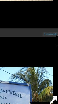
After loading is complete, the web page is displayed full-screen with an arrow shortcut to the menu on the bottom right. Dragging around causes the scrollbars to appear momentarily.

Double-tap zooms into the web page.

Landscape mode delivers a more desktop-like feel as it allows greater page width.

& like on a real desktop you have a mouse cursor controlled by the direction pad. (Yeah, it can’t render my blog!)

There's both an overlay menu & a traditional menu that gives you options to reload the page, save as bookmark, search the page & custom zoom.
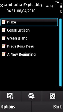
The S60 browser also has a built-in basic RSS reader.
Although I haven't used it a lot, the S60 browser is capable of rendering most popular websites correctly, except for a few, including a certain twitter.com
The problem is probably with the slow hardware incapable of executing JavaScript rapidly, which means the browser struggles to keep up with the live updates that are constantly refreshed on your Twitter timeline. After a while, the browser just froze itself & I had to kill it.

YouTube is supported, but not via Flash. It’s an optimized for mobile video (flv/mp4).

A double tap allows full-screen playback.

Adobe Flashlite 3.1 adds a somewhat incomplete support of Flash content since it doesn't support Flash 9/10. Hence, the non-mobile version of YouTube doesn’t work.

The problem is that once I load a page with Flash, the menu arrow disappears... I can no longer go back. I have to kill the browser to be able to browse another page. :S
To sum up, the S60 browser is sluggish, lacks basic features (Search panel, Tabbed browsing), is liable to crash on heavy websites & has a dreadful UI. Far from delivering a desktop experience, it can't even compete with other mobile browsers...
Ovi Store

The Ovi Store app gives access to the online Ovi Store where you can download/buy apps, themes, games, ringtone, trailers, etc.
Upon running Ovi Store for the first time, it'll be updated to the latest version & you'll be asked to sign in your Nokia account. Your Nokia account is the same as a Google account, but this one is for accessing Nokia services.

The Ovi Store offers a list of recommended apps, both free & paid in a wide variety of categories.
However, not all apps available for the N97 is on Ovi Store. Developers can sell their apps on their own websites... On Ovi Store, paid apps have no flat price, but range from €1 to €10.

Each app page has a description, screenshots, user ratings & comments (very few). Apps can be downloaded & installed straight-away.

As with all app stores, the best apps are harder ones to find. For e.g. Opera Mini was tucked away on the 3rd page of recommended apps. Most of free apps are good, but with most being rated 4 stars, it's hard to judge unless you try them out.
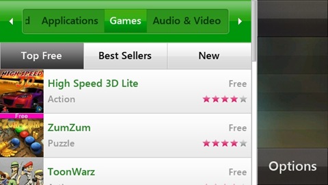
Games? Stay away from them, even some of the free ones. Yeah, they are that bad... o_O
Ovi Maps

Ovi Maps is Nokia's free alternative to Google Maps. Requires a Nokia Account.

Uses the built-in A-GPS to fix your position (GPS doesn't work inside buildings) & the built-in magnetometer for orientation...

...from which you can walk around, pick a destination, plan your journey. There's also free turn-by-turn navigation, but I don't think it's available for Mauritius.

& another reason why I wouldn't want directions is because the maps are wrong. Roads are completely off-target. So if you stay in Mauritius, better use the more accurate Google Maps.
Settings

In here you'll find all the settings for your N97.

In Profiles, I liked the inclusion of timed profiles.

& also when you're searching for a ringtone, songs are no arranged alphabetically but according to artists, albums, etc.

Themes allows you to change the look & feel of the UI.
Here are some examples...

Note that custom themes have a heavy footprint on the RAM... That's the reason why I'm stuck with the default Nseries theme on the N97. :(

Phone settings contains all the miscellaneous settings. I miss the display setting in older S60s where you could completely turn off the backlight. Application settings gives access to the settings of all native apps in one place.

Sensor settings gives control over accelerometer-based behaviours - flipping the N97 can be used to silence a call or snooze an alarm. I hope Nokia will be adding more such "actions" in the future. Portrait to landscape mode auto-rotate can be disabled here. One complaint I have with the rotation is that it's too slow - slightly more than a second. Fortunately I discovered an installable hack that speeds it up to around half a second. :D

Touch input contains the settings for the touchscreen. Handwriting training is available for stylus-lovers, but there weren't really any improvement after I tried it out.
Notification lights settings are for the menu key... There's a breathing light setting & timely blinks in case of events such as a new message.

Back on the main settings screen, there's the Application Manager which lists details of all installed apps & permits their removal.

Java apps have another settings menu to control its behaviour & to disable the default the on-screen controls.

Because some Java apps look for hardware controls, on-screen controls had to be added to maintain compatibility with older versions. Most Java apps developed for S60v5 do not require the controls.
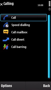
Calling settings has all the necessary adjustments for the phone part of the N97.

Connectivity is the one settings menu that's used almost everyday to turn on/off Bluetooth, connect to WLAN, add Access Points.

In the Applications folder, there are the usual apps like Clock, Camera, Notes, Real Player, Logs, Help, etc. & there's also a few apps that should actually be located in Settings - Location (GPS settings), Phone Setup, SW Update, Accessory Setup & Settings Wizard.

Nokia have added a very handy app called Search which can be used for system-wide searches in Messaging, Contacts, Places & Music. Also available was Google Search. Unfortunately I couldn't find a way to add new Search providers...
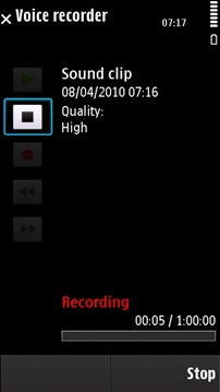
The built-in Voice Recorder allows up to an hour of recording.

Msg Reader is an app for reading out Messages for the visually-impaired. Horrible voice btw.

Having a touchscreen & a stylus, the next step is obviously a drawing app. This Drawing app by Nokia is quite basic - text input, clear all changes, pen, line, circle, rectangle, eraser, line thickness, colours & an undo button.
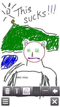
The complaint I have with this app is that the lines drawn are too blocky. If it was a tad more smooth, drawing would have been awesome!

In the Office folder, more office-oriented apps available. Including a dictionary app by Nokia. However, when I tried to download new dictionaries, all I could find were translation dictionaries…

File manager & zip manager.

Calculator & converter.

The QuickOffice suite consists only of Office documents viewers - Word, Exel & Powerpoint. Editing is available in the commercial editions. I’m surprised that version 4.2 was included given that version 6.0 is already. & as expected, formatting is broken when opening documents. Office 2007 file formats not supported.

If you're looking into writing a document, editing a workbook or showing a presentation... well, forget it. Google docs on the browser might be better than this.

Also available is a trial version of Adobe Reader LE. Dreadfully slow & with the same old unintuitive S60v3 UI, don't expect to read your ebooks on this...
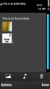
Active Notes is a kind of of super-note-taking app which combines text, photo & audio... Interesting app, but I don't see anyone actually using it.
UI Inconsistencies

Probably the first thing you'll notice on the N97 is the overly large menu keys... It takes around 25% of the screen space... With the exception of the browser (auto-hides them) & the Photos app (transparent overlay over image), this horrible contraption is present everywhere...
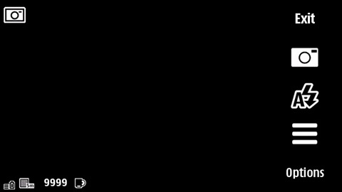
Even on the camera app... It may be finger-friendly, but definitely not justified by the waste of screen space.

Another example of the lasting heritage of S60V3 - traditional menus.
When using the browser, I have two menus - a pop-up icon grid menu & a traditional scroll menu. Sure, they've made it bigger, but in terms of usability, it's a no-brainer - the icon menu is easier to tap (with your large fingers), icons are more recognisable & you have more options!

Only a few native apps have such an icon menu, including camera, photo editing. If Nokia themselves don't want to spear a more finger-friendly approach, why would 3rd party app developers do so? The N97 is so like the old stylus-based touchscreens...
Single tap or double tap? While most native apps behave similarly, 3rd party apps disregard any UI navigation guidelines.
However this can be explained by S60v5 being just a touchscreen optimized version of S60v3, most of the apps were ported over from their v3 versions & haven't been actually developed from ground-up as a touchscreen app.
Another complaint I have is the lack of touchscreen interactivity on the home screen, or rather the waste of screen real estate. It's probably the only the OS to have an Options key on its home screen. Forget that, but I'm more concerned that tapping on the network & battery levels doesn't open up a Network info or Battery info page. It's the little details like these that make all the difference between a good OS & a great OS...
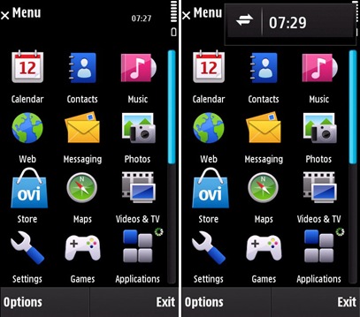
In the main menu & in some of the apps, in the notification area, a digital clock display is shown. Tapping on this clock shows shortcuts to the Connectivity settings, the clock & to new messages (if available). That's the shortcut I use most of the time to turn on Wifi. However, on the Home screen, the shortcut is still there, but there's no indication of its presence because there's already the Clock widget.

Hence, trying to access the shortcut usually requires several taps in that area since you don't know where exactly to tap. A simple icon could have solved this problem.
When using the keyboard to select text, holding the Shift key displays copy/paste on-screen. Why not use shortcuts? Shift+C & Shift+V, like the N900. The N97 has been marketed a portable computer, then why haven’t Nokia thought of adding keyboard shortcuts... Only certain 3rd party apps make use of them.
The Bottom Line

I've been overly critical of S60v5. Don't get me wrong. The S60 core is the best mobile OS available. That’s why it still is the most used mobile OS in the world. If this OS was on a non-touch screen device, I would have been a very happy bunny. But on a touch screen, it just doesn't make sense. My point is that the UI is messed up & what's needed is a complete redesign from scratch (like WP7).
Apart from the UI quirks, most of the problems with the N97 can be traced back to two main causes - CPU & memory. The UI lags & the hanged processes is all due to the slow CPU trying to keep up with processing data & rendering a massive 640x360 screen. Lack of memory is the chief cause of all app crashes. If Nokia had added another 128MB of RAM, the N97 would have been awesome.
A half-baked touchscreen OS on some puny internal hardware is what makes a high-end device like the N97 a terribly crippled product... :(
In the next part of this review, I'll be looking at multimedia capabilities (music & video) & whether 3rd party apps can salvage the reputation of the N97...